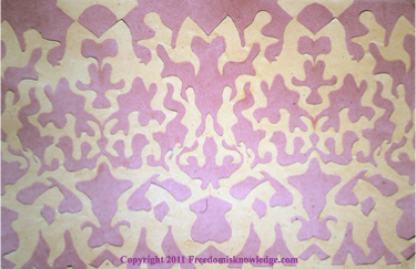
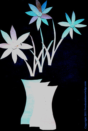
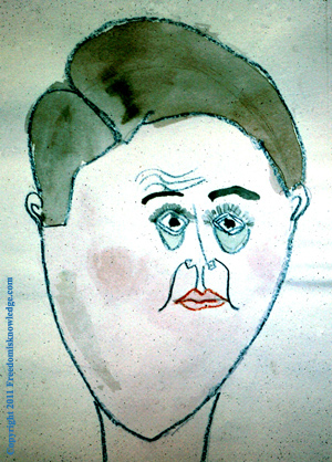
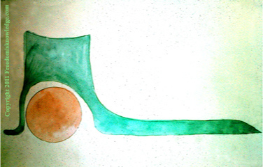
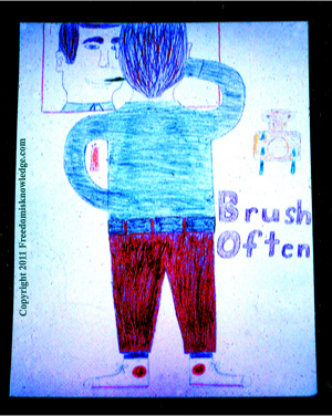
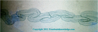
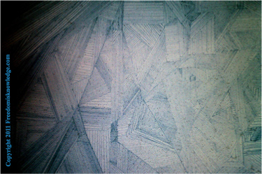
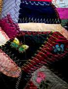
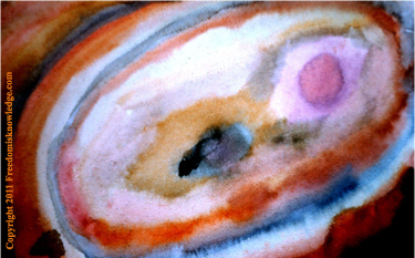
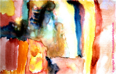
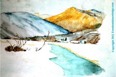
Examples of Elementary Art Projects 1966 - 1976
d
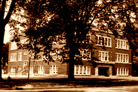 |
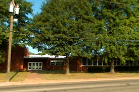
| South Ward Elementary School |
 |
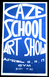
| Caze Elementary School |
The following art projects shown below you are about to see came from mostly elementary art classes of two different schools in Indiana. The first school was a much older building called South Ward Elementary School and located in Northern Indiana. In my recent research I discovered the school building has been turned into a condominium. I taught at South Ward in the early to mid 1970s.
South Ward was responsible for educating children from 1st - 5th grades. A few teachers had complained about the older age of the school. But it serviced a solid-blue collar community, students being taught values at home that reflected the 1950's America I grew up in and away from the liberal white collar communities.
The students I met were always well behaved, taught to respect their country's values and the authority of their parents. As a teacher, I could also count on parents always being involved in the education of their children.
Before going to South Ward I taught at Caze Elementary School in southern Indiana in the late 1960s. It had a similar demographics of South Ward, which also supported a mainly blue collar neighborhood.
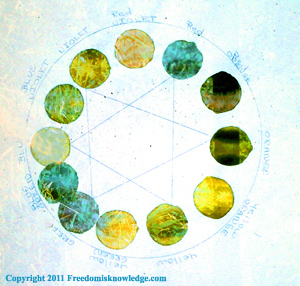
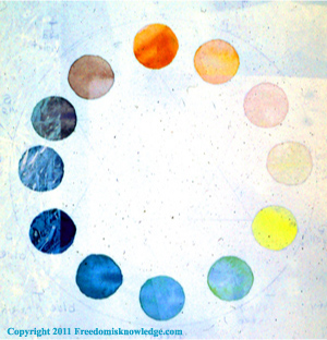
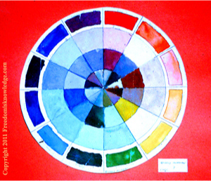
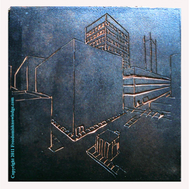
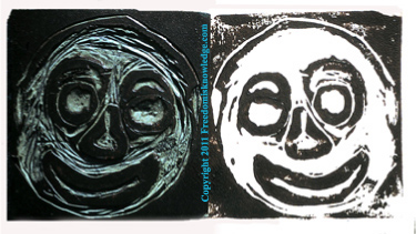
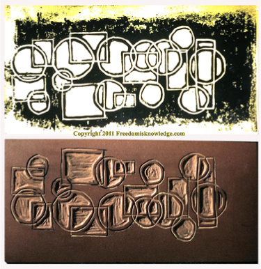
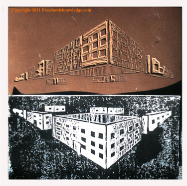
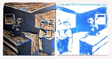
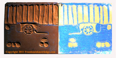
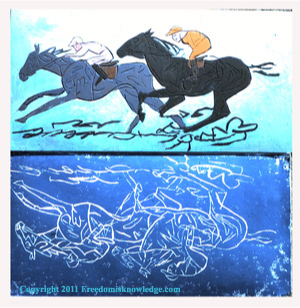
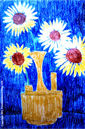
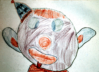
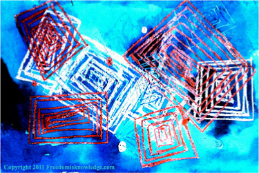
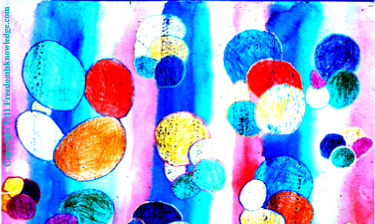
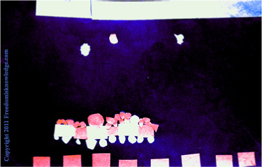
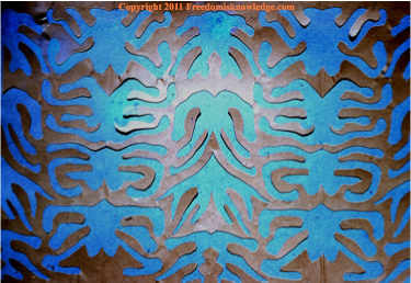
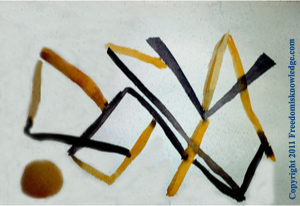
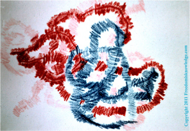
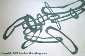
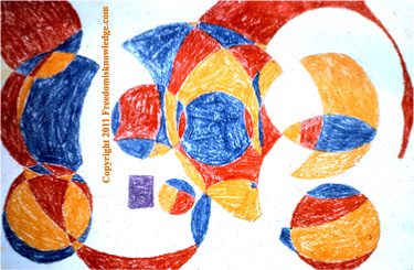
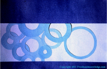
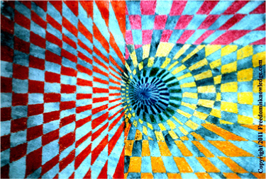
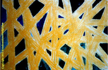
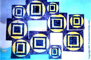
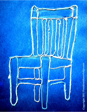
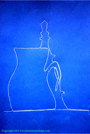
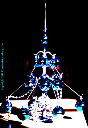
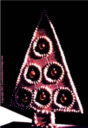
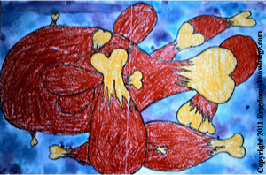
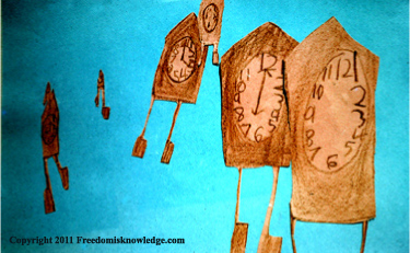
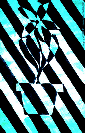
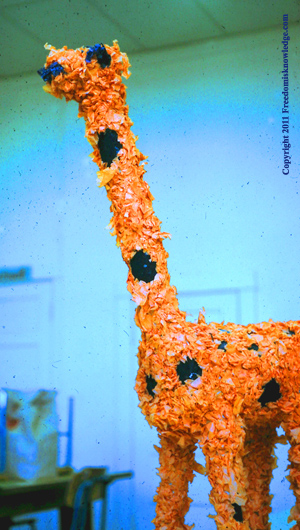
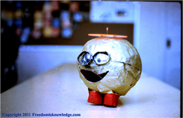
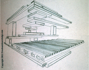
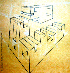
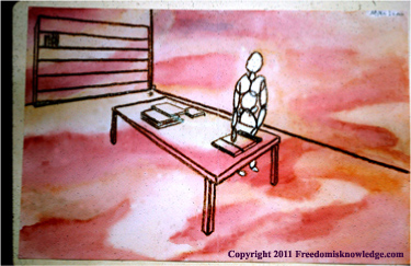
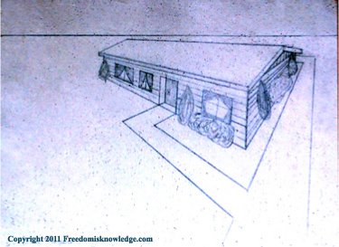
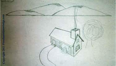
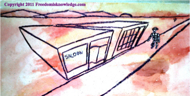
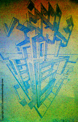
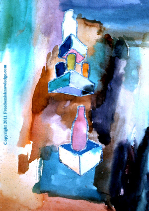
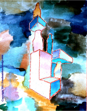
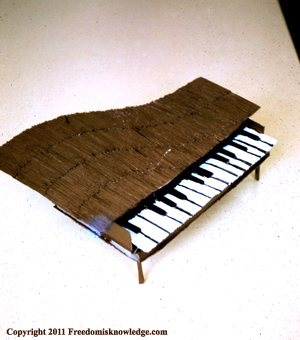
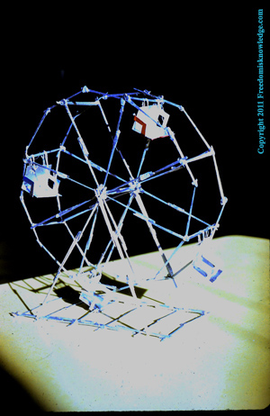
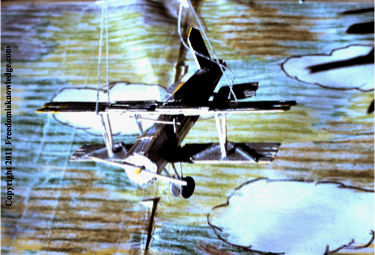
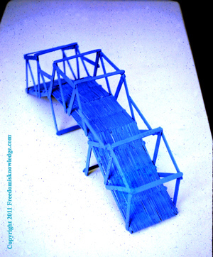
So the art work seen below is from 1966 - 1976, representing ten years of teaching in these two educational communities. If you right click on any of these art project photos you will see the file name, which ends with the grade level the art work was created in. You will find some 6th, 7th, and 8th grade references. Since these slides were labeled during the year the art was created, one of these schools must have had some older classes from the middle school, although today they all show teaching students from 1st - 5th grades.
Finally, teaching art for me was to convince children not to be afraid of having fun in the art world, that there are no winners or losers only hard work with the reward of a creation they might not be aware they were capable of producing. Their appreciation of these art topics could help them as they grew into adults and sought out their careers in life, from choosing the style of home they might buy to decorating a living environment or office.
Again, these art projects are from 35 to 45 years ago, with some of these students now turning more than 50 years of age.
- Webmaster / Art Educator / 3/10/2011
__________________